To have your work inspected by strangers is a normal occurrence for wood turners. Every piece you make, whether it is a bowl or a newel post, a work of art or a functional item, should be of the highest quality that you are able to make, this is what I aspire to. To have your work inspected before you have made it is quite strange,well it is to me anyway. I took my drawings along to the church with the cut out model that I had made and spoke at length about the design and the timber, the colour and composition and the finish, trying all the time to paint a picture in words that would do my design justice. There was one comment which at the time I was a bit narked about, the suggestion was to make the hourglass a bit thicker, on drawing this in I could see instantly that this was the right shape, I can’t remember who said this but whoever it was ,thank you. I then left the PCC meeting and went home happy that I had given it my best shot. I heard very soon after that they liked the design and had approved the forwarding of the plans to the faculty meeting. There then followed an anxious wait for permission to start during which time I proceeded to make more than 20 full sized drawings covering every detail of the font. Because of timber prices I had to re-work some of them to accommodate different timber sizes. Deciding eventually on the best size to use I then drew the final constructional details

The font sizes agreed were such that it would not fit onto my lathe as it stood and so alterations were made.A very good friend of mine for many years as well as a first class engineer,Mark made a plate to lower the lathe bed and drop it out a bit.I then made a set of cole jaws to fit my existing set and increase my turning capability, I made these from 3/4” plywood and bolted them on. These were necessary to be able to flat the rings made for the font support and bowl itself. I was delighted when turning the lathe on that the cole jaws ran true and there was no wobble, but I was less pleased when I turned the lathe of as it had been programmed to stop within 5 seconds (I didn’t know this at the time) as the spindle stopped the chuck with my newly made cole jaws carried on proceeding to unwind and fly across the workshop!!
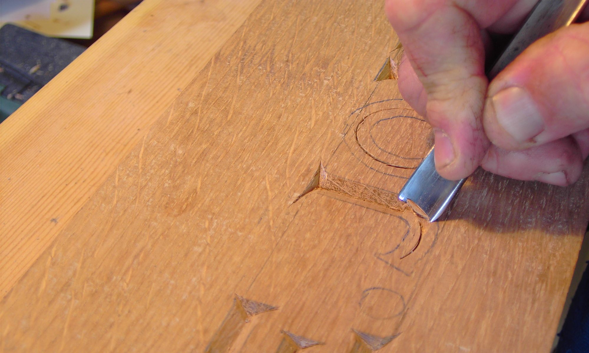
Locally there is a timber supplier,Oscar Windebank at Box , which is just outside of the Georgian city of Bath.They allowed me to sort through the timber I needed, which was European Oak and of very good quality.I didn’t want wood that was the same colour all the way through,although it had to be as straight as possible.As it turned out this Oak was some of the best I had ever used,the colour and figuring only enhanced the finished product.And so onto the production methods used.
Hi John.
Thanks for the mention. I feel honoured to have helped you and been part of this project, however small that part has been. And yes, it has been more than just another commission.
Best regards
Mark
Dear John,
What a beautiful font: it is quite exceptional.
I found your articles whilst researching fonts for a writing project.
I had never heard of a modern, wooden font before.
It is a real credit to your craftsmanship, talent and hard work.
Those who are christened in your font must be truly blessed.
Warmest regards,
Ingrid M. Smith
Australia